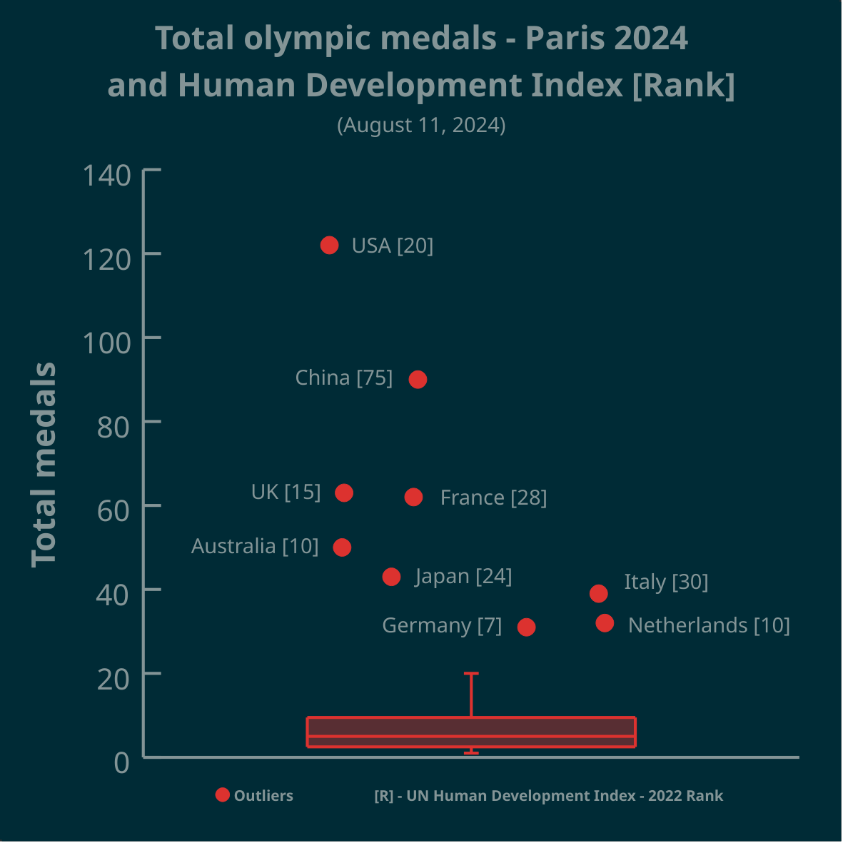
▶️ Total olympic medals won in Paris 2024 and Human Development Index 🏅
➡️ https://www.businesstimes.com.sg/opinion-features/what-olympic-medal-table-really-tells-us
After reading the article we made this #boxplot using #LabPlot, an open source data analysis and visualization software.
The plot doesn’t provide answers, it rather invites some thinking.
#Olympics #Olympics2024 #France #China #USA #UnitedStates #UnitedKingdom #UK #Brazil #Australia #Japan #Italy #Canada #Germany #Italy #Netherlands #DataAnalysis #DataScience #OpenSource #FOSS
A boxplot is a visualization tool to quickly get an idea of how the data is distributed. In this population the outliers are so large that the info the real box + whiskers give is very low.
In your title you suggest investigating a relationship between total Olympic medals and HDI - why not choose a scatter plot here?
That the number in square brackets refers to the HDI rank only get’s clear on the second look.
The outliers being distributed over the X-Axis is confusing.
Sorry but this visualization is not beautiful, rather the wrong method used that cannot display the hypothesis stated in the title.