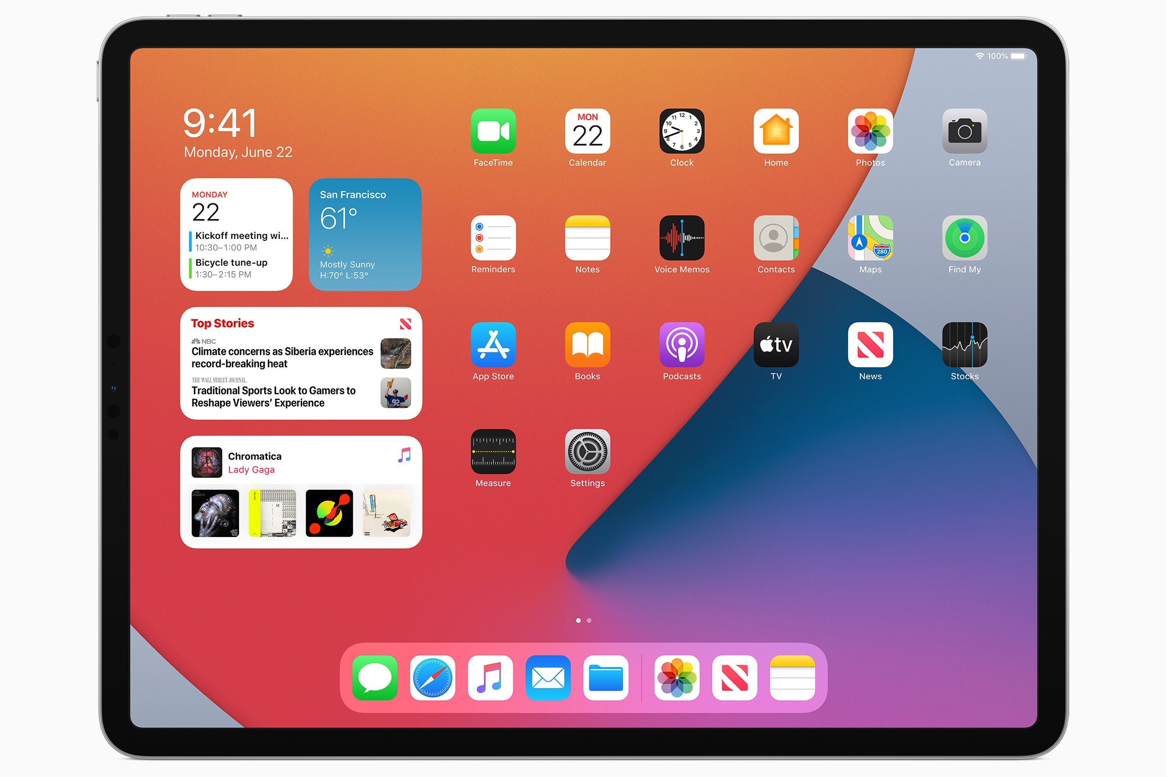
The widgets you add to the home screen aren’t the same as this Today View. Know how you side left from the first page, and it has a widgets view? The iPad had the option to keep that view permanently on the screen and bunch the icons to the right. The option was called “Keep Today View on Home Screen”:
Yeah, I see it’s slightly different from today’s widgets on the Home Screen. That’s closer to how I wished it worked, but how it works now seems more flexible
Yes, this (from iPad OS)

The digital clock widget? Other than that, it’s very similar to my current iPad Home Screen layout
The widgets you add to the home screen aren’t the same as this Today View. Know how you side left from the first page, and it has a widgets view? The iPad had the option to keep that view permanently on the screen and bunch the icons to the right. The option was called “Keep Today View on Home Screen”:
https://www.macobserver.com/tips/quick-tip/today-view-iphone-ipad/
https://youtu.be/Y6YY06bLEEo?si=w1MHfiw1GJD6yjSg
IMHO, it was a much better implementation of home screen widgets than what we have now.
Yeah, I see it’s slightly different from today’s widgets on the Home Screen. That’s closer to how I wished it worked, but how it works now seems more flexible
Here is an alternative Piped link(s):
https://piped.video/Y6YY06bLEEo?si=w1MHfiw1GJD6yjSg
Piped is a privacy-respecting open-source alternative frontend to YouTube.
I’m open-source; check me out at GitHub.