I don’t think I’ve ever seen what appears to be a line graph loop back on itself.
Visualise it as a 3d graph seen from the top.
Math people are cringing.
But in this graph it’s correct, isn’t it?
A bit of a strange choice of axis, but technically it’s correct, I think.
We see how during COVID people died earlier although expenses went up (didn’t check the dates, but I guess that’s the thing?), and afterwards expenses went down, but people grow older again
Or do I completely misunderstand this?Yeah, it’s correct. What they did is, for every year they place a dot with respect to x and y axis, then connected the dots. An unusual graph, but works well for this situation, IMO.
I have a degree in math and I’m not cringing
Can we please always link to the original data?
Can you guess when HMOs became a thing (and Blue Cross converted from not-for-profit to for-profit)?
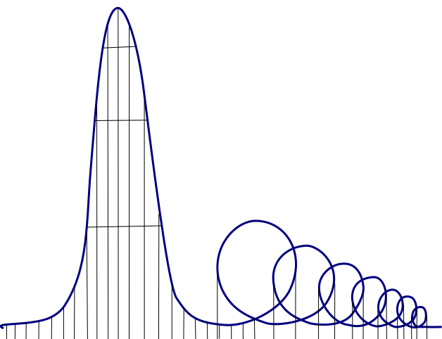
The US is on track to implementing the Euthanasia Coaster.

INTERNATIONAL DOLLAR (PPP)
COUNTRY MONEY (GDP)
Not to worry, it’ll soon dip back down as the Almighty, who is also the Invisible Hand Of The Free Market, wills
Whoa, wtf is Polandball doing?
I didn’t know such differences still existed (not counting USA ofc).What is Chile doing?
Just Chileing?
Too chilly hot to chilly chill.


