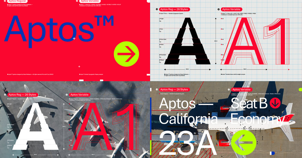
I think it’s an improvement. The characters feel a bit more confident if that makes sense. In particular, I think the M Q and S kinda suck in calibri. But honestly calibri kinda sucks in general so doing one up on it isn’t that hard. I think aptos is a bit too bubbly for a default. I do like the curve on the l though. Still I think there are better fonts.

I think it’s an improvement. The characters feel a bit more confident if that makes sense. In particular, I think the M Q and S kinda suck in calibri. But honestly calibri kinda sucks in general so doing one up on it isn’t that hard. I think aptos is a bit too bubbly for a default. I do like the curve on the l though. Still I think there are better fonts.