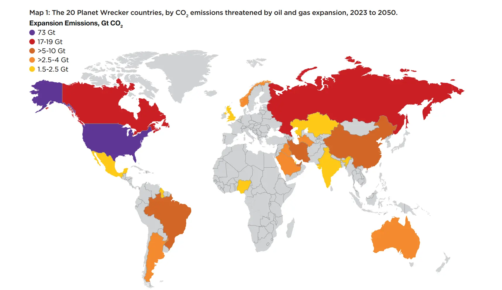
It’s essentially a map of big countries (population, territory, population density…)
This map would be way more interesting if it was normalized per capita or some other meaningful denominator. Only then does it make sense to point fingers.
It’s about future oil and gas expansion (FOGE), what matters to the atmosphere is the total - identifying potential threat.
Effectively multiplying FOGE by area (as shown) doesn’t make sense, but neither does FOGE per capita (as most is exported, not consumed locally). I’d suggest just a sized blob for each country - then can show some other dimension with the color.

It’s essentially a map of big countries (population, territory, population density…)
This map would be way more interesting if it was normalized per capita or some other meaningful denominator. Only then does it make sense to point fingers.
China and India have 5 times the population of the USA, and yet are 1 order of magnitude or more below the USA. You’re not making sense here
It’s about future oil and gas expansion (FOGE), what matters to the atmosphere is the total - identifying potential threat. Effectively multiplying FOGE by area (as shown) doesn’t make sense, but neither does FOGE per capita (as most is exported, not consumed locally). I’d suggest just a sized blob for each country - then can show some other dimension with the color.