
- cross-posted to:
- aboringdystopia@lemmy.world
- cross-posted to:
- aboringdystopia@lemmy.world
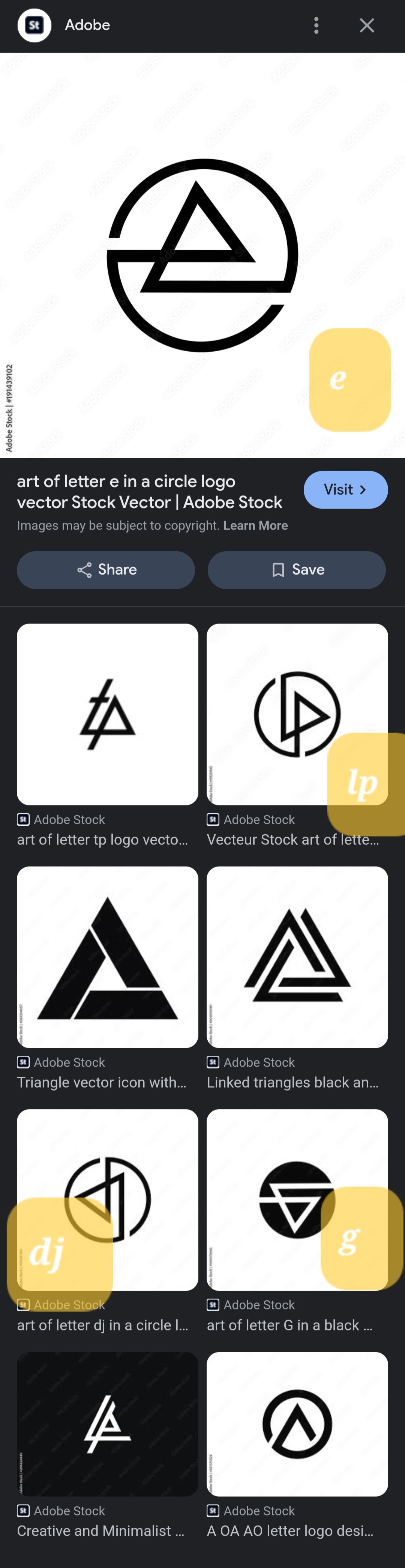
They’re all the same. Rotated 90° for each one. Except for the ‘e’, they flipped that one.
They’re all the same. Rotated 90° for each one. Except for the ‘e’, they flipped that one.
Is it just me or do they really closely resemble the Linkin Park logo?
These are all rip offs of the Linkin Park logo. One is literally the 2008 logo rotated. I thought this was a Linkin Park post when I saw it
Good shout, I was thinking the Audio Technica logo but LP logo is closer