What design language/guideline is better: Google’s Material Design, or Microsoft’s Fluent Design?
That’s a subjective question. I personally like Material You more, but Fluent is good too
“Which paint is better: eggshell white or oyster white?”
you don’t fully know until you taste it
It’s a personal thing, I guess, but Microsoft UI designs (to me) look all god awful crap permanently stuck in 90’s computer UIs.
Every time I see teams or -gagh- outlook, I have to vomit a little in my mouth, its just off putting.
I don’t like google either but at least their UI mostly feels nice
Then there is apple, but usually the “keep it simple” is way, WAY pushed too far.
Apple’s skeuomorphism was the best looking for me. Now everything is boring flat. I hate flat design, hope it goes extinct ASAP.
We used Fluent at a previous job. My recco? Don’t use fluent.
I feel like the team ended up having to work around it for anything with any amount of complexity.
I mean, it’s incredibly subjective.
Personally I’m more a fan of material, but it isn’t without it’s faults.
both are f’n ugly as hell and unusable fucking eye targeting missile
Disclosure: I’ve done very little UI/UX.
Google’s Material Design (wikipedia) is much more widely-adopted across OSes/Flutter/the web (see how many websites have that dropshadow topbar and ≡?); Microsoft’s Fluent (wikipedia) is Windows-first, but is usable anywhere.
Both are based on responding to user actions. Fluent uses lightup acrylic (translucent) canvases (e.g. hover? border glowy.)
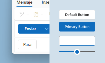
while Google’s Material uses paper-esque whitespace, navbars, dropshadows, and round corners. (e.g. scrolling? dropshadow appears on nav)

Think Microsoft Teams vs. Google Drive.
They’re both full-fledged but Material You is way more common judging by places such as the F-Droid ecosystem on Android. As for which is “better”, Material You supposedly has better colorscheme flexibility since it ‘wants’ to adapt to e.g. user wallpapers. But other than that it’s really just preference (or whether relevant tooling exists :P). I know some devs use Material You for a predictable, unified look across Android apps, while others bend them to their will to reduce animations or whatnot.
If you’re designing something, make sure you keep your own self in the mix too. Breezy Weather uses Material Design, but it’s more customized to have a unique feel than, say, TrackerControl (which also uses Material).
Material Design is nice, but “Material You” is a drastic misstep and garishly awful, extremely unpleasant to look at and interact with all around with the gross pastels (especially that skin colour one ewww).
Hopefully we go back to the Android 8.1 - 10 design language as that was the best of Material.
Material works, but sometimes it really gets so ugly I feel like puking.
Big fan of Material
Remind what a design language is?
Is this like a brand guideline of specific colors and rules to follow? Or like a prestyled UI widget pack?
@etchinghillside@reddthat.com It’s a set of UI design guidelines
Better?
Are you sure they aren’t overused? 😉
I personally prefer Material You

