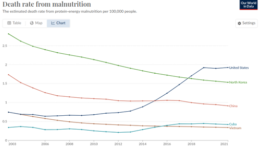
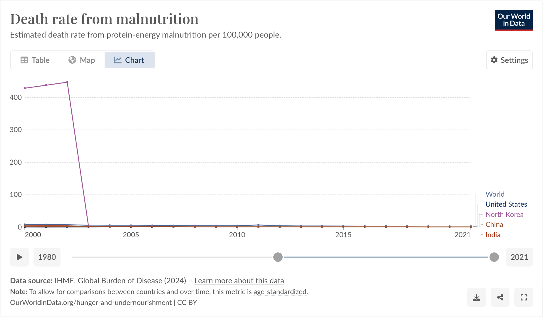
This is a weird one. Bear with me. From !dataisbeautiful@lemmygrad.ml:

So I said to myself, “that’s a little bit weird. The US one going up, I can actually believe, but the North Korea one being lower is definitely wrong.”
I think Our World In Data is just being shoddy, as they often do.
https://www.wfp.org/countries/democratic-peoples-republic-korea
The thing I found funny, and why I’m posting here, comes from observing why it was that they started their graph at 2003 and exactly at 2003.

I feel like you could use this as a slide in a little seminar in “how to curate your data until it matches your conclusion, instead of the other way around.”
And also, I don’t think the hunger rate suddenly dropped from epic to 0 exactly in 2003, I think more likely Our World in Data is just a little bit shoddy about their data.


Something else to consider, whether Cuba, DPRK, or anywhere else is the impact of sanctioning.
Edited to hopefully correct formatting
Yeah. In addition to causing massive suffering, they often work backwards, too, strengthening the regime they’re trying to weaken.
Also. In the early 60s, the list of communist countries in the world was:
The list of countries with State Department restrictions preventing US citizens from traveling there, with severe penalties, was:
The list of countries which are still communist today is:
Preventing a communist country from being visited by tourists from the US, to “punish” them, is among the most effective methods ever devised for strengthening its communist government and allowing it to keep its hold on power.