
21·
19 days agoThey’re not, they’re complaining about the problems inherent to cars.
They’re not, they’re complaining about the problems inherent to cars.
“Driven” suggest more than half of total pregnancies,
Less than 20% of a total is “significant”?
The amount the percentage represents is irrelevant. A billion people could be involved, but if the total is 7 billion, it’s not going to be a significant part of the total trend.
In the terms of your analogy, this is about 3 people out of 20 pedaling a (weirdly long) bike and steered by all of them (somehow). Would you say that group of 3 are driving? Or would you concede it’s the two groups of 6 that are mostly driving the bike?
Your “words wholly” includes more than whatever you think it does.
My point has always been about this study
Has it? I think you’re far less clear and careful with your words than you think you are. You’ve been arguing from the start that less than half of something isn’t and can’t be significant. We aren’t even discussing the text in this study that you can read in the screenshot:
More than half the drop of America’s total fertility rate is explained by women under the age of 19 now having next to no children.
What you’re saying now about “the traditional driver of USA birth rates” isn’t reflected in your other comments.
Your numbers are all over the place and don’t really make sense for what you’re talking about. 3 plus two groups of 6 would only be 15 out of 20, so where did the other 5 people go?
But more to the point, if those 3 stop pedaling, or pedal harder than everyone else combined, or apply the brakes, or tip the bike over, any number of other things they could absolutely change the speed/direction of the bike.
Yes. For example, 60 million people in the US (less than 20% of our total population) is a significant amount of people.
In the original there are 50, 16 rows of 3 plus 2 more.
Aren’t we always?

Apparently Australia only got around to it last year, but they’re requiring it to be implemented a lot faster.
If by “new” you mean decided a decade ago and implemented 6 years ago, then yes.
It’s not like netflix is the only one that can offer that kind of service. You’ve still got gamefly, 3D Bluray Rental, cafedvd, redbox (if you’re fine with going to a kiosk), your public library, and probably others if you care to search for them.

Then why are you here, trying to start arguments?

‘My personal health has declined to the point where I really need to start taking care of it. Throughout the entire project, we haven’t shared it with you, but I’ve been in and out of the doctor’s office.’
From the article. He was going to a doctor throughout the entire “experiment”.
Seriously now, why don’t you provide some clearer evidence showing what SBI is doing and why it’s so bad? And why respond to my short summary of the video when @CileTheSane did a much more thorough breakdown?
We all know it’s because you don’t actually have any proof or solid reasoning for thinking these things, and you probably responded to me and not them because you’re too lazy to read their longer post and think up a lie. But Cile watched a half hour video because of you and put some thought and effort into applying it to your fake arguments, you could at least try to defend your bigoted views.
The first half of the video is about context-less tweets that a consultant for the company made a decade ago, and the second half is about how they don’t like how some things were phrased at a GDC talk. The guy in the video also talks a lot about Sweet Baby Inc supposedly wanting to exclude straight, white, male characters, but one of the anecdotes they play from the GDC conference was about how some game studio had made a cast of all straight, white men and were thinking of diversifying by making one of those characters very stereotypically french, and so SBI consultant tried to get a little more diversity out of them by also making that character black.
I’m not seeing a lot of hatred or discrimination against white people, or men, or heterosexuals in this video you linked.
But there is the end segment, in the last 3 minutes or so, where he doesn’t understand that there’s a difference between being a Diversity, Equity and Inclusion consulting firm, and a narrative/writing consulting firm that helps promote diversity and inclusion, so that’s fun. He also ends the video by saying that the consultant with the bad tweets from a decade ago is one of the company’s leaders.
All in all, not a lot of evidence that Sweet Baby Inc is doing anything wrong, really.

You should probably be looking at trends over a longer period of time, rather than just a single month.
From here. There was a dip below the 2016-2019 average in January through March of 2023, but time marches on.
The numbers for 2023 are no higher than normal either
The numbers for 2023 in the 2-3 months you have data for. Look at the rest of the graph, how it starts off lower in January and is higher for the rest of the year. Go back up and look at this graph 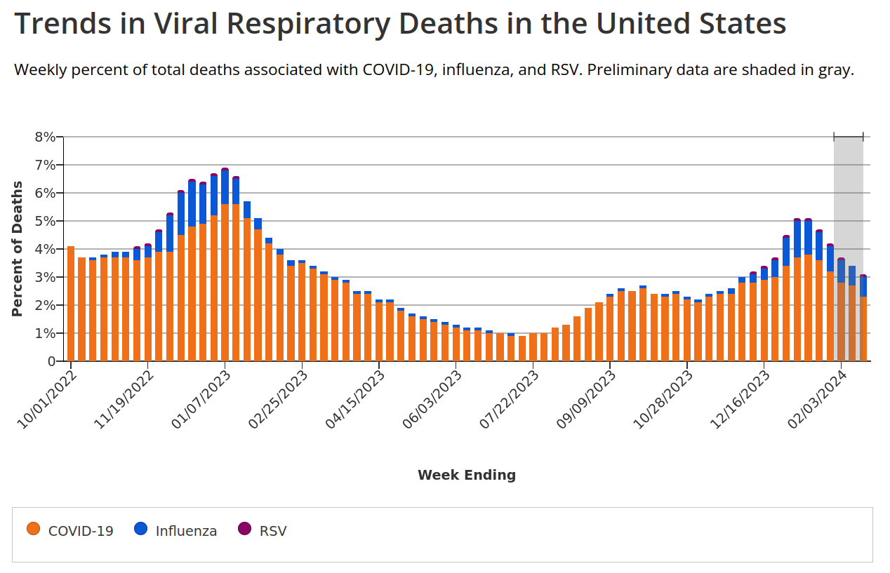
and see how covid comes in waves each year, not evenly distributed throughout. Then go back and look at this graph 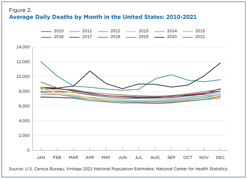
and see that based on the data we have in the US, deaths per year has stayed above the previous yearly patterns. We don’t have all the data over a long period of time because covid hasn’t been around for all that long. But from what we can see so far, it kills people. The exact number per year remains to be seen, but from the data we have it’s been in the thousands, just in Norway.
Edit: I guess next time I see a fucking “mOVInG tHe GOOalPoSt!!!” I will take the clue and not fucking bother.
Half of the sources you posted actively worked against your own arguments. Maybe you shouldn’t bother.
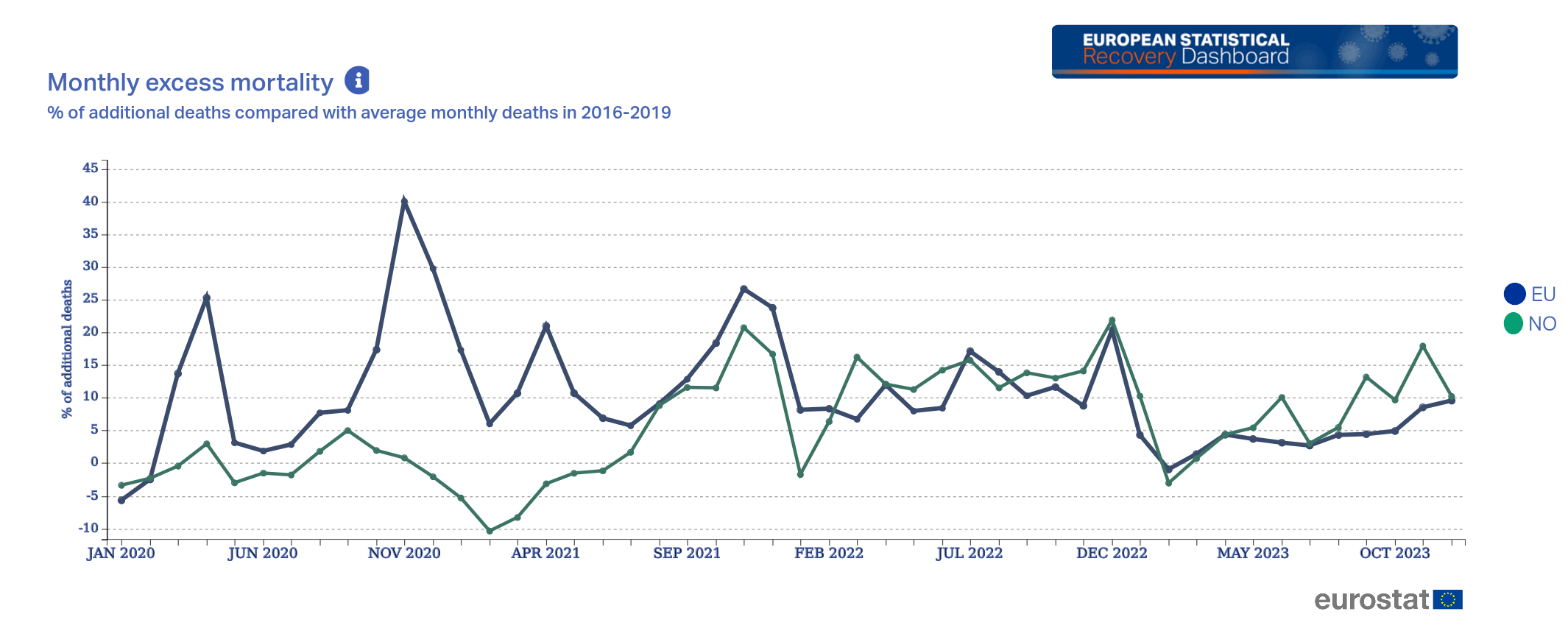
EDIT of my own: After looking at one of your sources (Eurostat)
you can see that January-March was lower than 2016-2019, but it’s been on the rise again across the EU, and especially in Norway. Again, you can’t just look at one single month and decide that it’s representative of everything, everywhere, across all time going forward.
From that we can conclude that after an initial burst in death numbers, as covid and other viruses passes through the populace, death rates return to normal.
I mean, no, we really can’t. There’s not enough data available (that I’m willing to search for) to say for absolutely sure that excess deaths has increased and will stay high, but even just the snapshot you provided here shows that it’s slightly lower in January, and massively higher the rest of the year. Maybe the May 2023 data shows that the numbers are evening out compared to 2016-2019, but the one year we actually get to see shows way more excess deaths over the course of a year compared to before. You can’t just look at the most recent month, that’s not how yearly trends and averages work.
You won’t have much of an argument that the numbers are going back to “normal” until you’ve got closer to a full year’s worth of data with that excess deaths line being close to zero.
So if I’m understanding you correctly, you went from
you still have to account for the fact that covid might kill an old person that would otherwise die to influenza in a month or two
thinking covid wasn’t causing any/many additional deaths per year, just speeding them up a little
to providing a graph that shows thousands of extra people are dying each year
The increase of 2022 and 2021 was expected due to general decline of normal viruses (caused by covid measurements)
to saying all those extra deaths were because people weren’t getting sick from normal diseases, despite us not seeing much of a drop in 2020 from people not getting those diseases during the covid restrictions. But now that the restrictions are lifted and they’re being exposed to those normal diseases (and covid) again, all/most of theses extra deaths are from the normal diseases and have nothing to do with covid.
Norway absolutely did a better job at handling covid than the US, but the US’s death rate seems to just be permanently higher now as a direct result of covid. Maybe removing all restrictions was the right thing to do, but we shouldn’t ignore the fact that it comes at the cost of several thousand more people dying each year, just in Norway.
It looks like you’re getting the data from here (except the Norwegian language version), so I have to ask: is there a reason you’re cutting off the part of the graph showing “Deaths per 1000 mean population” spiking in 2022?

This new table is from here, and you can click “Choose variables” at the top if you want to see different data. But even just the graph you provided shows that total deaths for both sexes jumped up dramatically in 2022, the year you say covid restrictions were lifted. What are you trying to prove here exactly?
Even if I ignore you moving the goalposts, would you really look at a graph like this
that’s a few years out of date and assume the total deaths settled back down into the old pattern?
I’m not finding a more up-to-date data source for deaths per month, but it’s not like you’re providing any kind of data that covid isn’t still killing a lot of extra people per year.

The risk is the point though. High risk activities will cost more to insure because they’ll need to be paid out more often. Couple that with the high destruction possible, and you have frequent accidents that can all cause very expensive damage, necessitating a high base price for insurance.
The price gouging is just capitalism, and I doubt anyone here is going to argue that capitalism isn’t bad.