I respect the current one.
I do prefer the old one, but the current one is still regonizable as a fox around a globe representing the word wide web ball.
I think from 2013 is my favorite. I’d probably like the fox from 04 and the globe from 13 the best.
17 and 19 are both cool logos on their own, but are literally duller then the others. They got rid of all the pointy bits. The fire gradients on both are nicely done.
I honestly like 2004 the best. I could see the issue with it then when resolutions were lower, but I feel like we could go back to it now. It looks so much nicer, though arguably less recognizable at a glance from across the room or something.

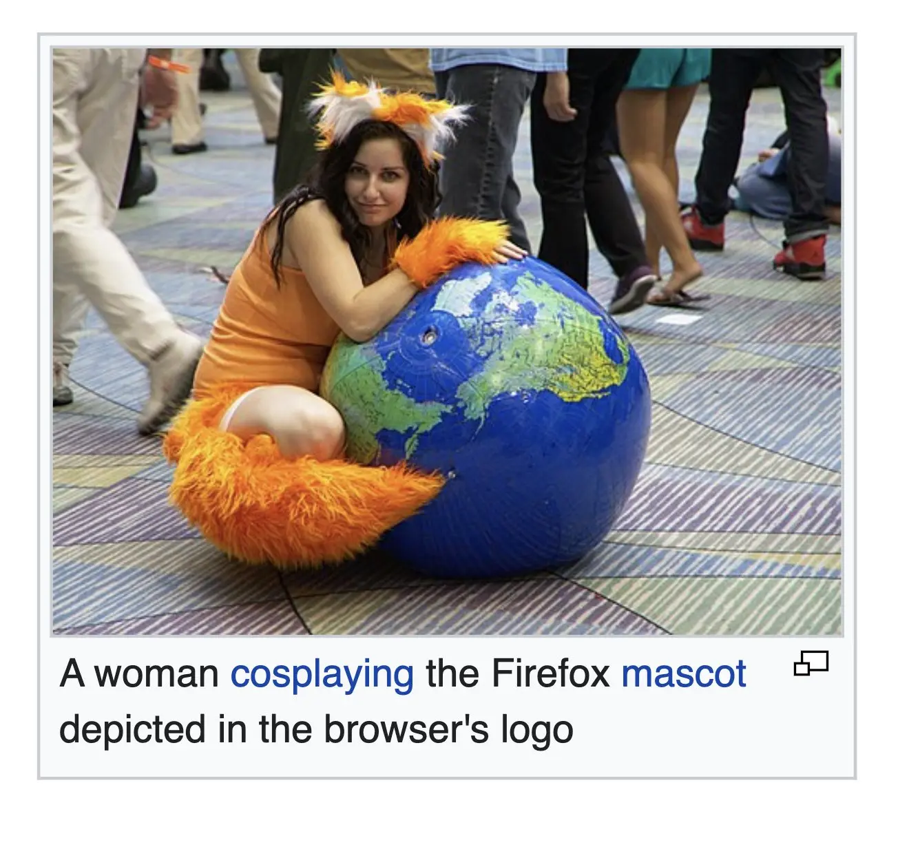
Nice cosplay. You gotta admit that the Firefox logo is better than all the other browser logos out there. It’s pretty lit.
the old ones, yes
I respect the current one. I do prefer the old one, but the current one is still regonizable as a fox around a
globe representing the word wide webball.I think from 2013 is my favorite. I’d probably like the fox from 04 and the globe from 13 the best.
17 and 19 are both cool logos on their own, but are literally duller then the others. They got rid of all the pointy bits. The fire gradients on both are nicely done.
I honestly like 2004 the best. I could see the issue with it then when resolutions were lower, but I feel like we could go back to it now. It looks so much nicer, though arguably less recognizable at a glance from across the room or something.
Is it though? Regardless of the amount of detail you still see the big orange swirl around the blue ball from across the room.
By so fucking much.