- cross-posted to:
- artdesign@jlai.lu
- cross-posted to:
- artdesign@jlai.lu
I hate these rebranding wanks companies love to do.
I love reading how companies justify their expensive rebrands.
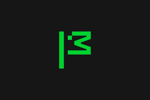
The flag symbol highlights our activist spirit, signifying a commitment to ‘Reclaim the Internet.’ A symbol of belief, peace, unity, pride, celebration and team spirit—built from the ‘M’ for Mozilla and a pixel that is conveniently displaced to reveal a wink to its iconic Tyrannosaurus rex symbol designed by Shepard Fairey. The flag can transform into a more literal interpretation as its new mascot in ASCII art style, and serve as a rallying cry for our cause.
Fuck off. This was designed by the intern the night before submission. It’s a fucking ascii dinosaur. The green doesn’t represent nature, it’s giving old monochrome monitor vibes, which doesn’t really scream “futuristic”. I’ve submitted enough bullshit design projects to know one when I see one.
You’re saying half-baked monochrome pixel art doesn’t come across as futuristic to you? Crazy!
To me it just reminds me of assets from the Dino game in Chrome. Good going, Mozilla.
To be fair, Mozilla had a dino first.
Yeah, and I very much associate it with Mozilla - the red one anyway. But the pixel art aesthetic brings Chrome connotations these days, and combining it with a dinosaur doesn’t help.
I’m happy to see the mascot get its time in the spotlight though.
This was designed by the intern the night before submission.
YFW you realise this was designed by a well payed marketing and digital design team that make more money in three months than you make in a year, publishes straight to production, regularly bypasses the VPN for work, and still doesn’t know how how to use the Oxford comma!
Also, I love how these things always need a lengthy explanation of what all this design vomit is supposed to mean and what it symbolizes, because there’s no way you could tell by, you know, actually looking at it…
Wtf… mozilla had like the coolest logo among current companies and they just decide to replace with… whatever this is 😶
I agree. It was fire.
Mozilla isn’t just another tech company
-> proceeds to act like any other tech company
Aw shit, Mozilla is dying and Google is losing Chrome. Google is going to buy Firefox and do what it did to Chrome.
can’t say I’m convinced of anything by a logo change…
What don’t you remember how much better Meta and x are?
They changed their logo into… a stick figure chicken head.
That’s certainly something they did.
Even though we’ve been at the forefront of privacy and open source, people weren’t getting the full picture of what we do. We were missing opportunities to connect with both new and existing users.
…so we decided to do a massive rebrand because that will give people the full picture?
“Mozilla isn’t your typical tech brand; it’s a trailblazing, activist organization in both its mission and its approach,” said Lisa Smith, global executive creative director at JKR. “The new brand presence captures this uniqueness, reflecting Mozilla’s refreshed strategy to ‘reclaim the internet.’ The modern, digital-first identity system is all about building real brand equity that drives innovation, acquisition and stands out in a crowded market.
Yuck. All this does is send me the message that Mozilla cares way too much about being a trendy brand and has essentially capitulated in the face of the so-called market.
I really hope this ends up working out for them, I hope that I’ll regret being so cynical about this announcement…
We teamed up with global branding powerhouse Jones Knowles Ritchie (JKR) to revamp our brand and revitalize our intentions across our entire ecosystem. At the heart of this transformation is making sure people know Mozilla for its broader impact, as well as Firefox.
Sure sounds like they’re trying hard to make sure everybody knows how great they are. I still want to believe they won’t abandon the mission, but I’m losing hope.
Is that a duck?
I was thinking chicken.
Is this a bad sign or omen ?
I guess you could read it as an indication of commitment to their change of direction. And their new direction sucks.
So yeah, I don’t read it as a good sign.
I would love to love Mozilla. I still like Firefox. But it seems everything they are doing is the opposite of what I would have wanted them to.
Hey, remember when the old Mozilla ‘throbber’ icon had a godzilla breathing fire on the planet or something?
Hey, remember when Mozilla made mozilla the app?
Hey, remember the time before SeaMonkey needed to be supported by volunteers because paid staff couldn’t do it for #reasons unrelated to being bored and sad at actual software maintenance?
Good times. GO BACK TO THAT.
Bad choices.
Well, I guess I’m in the minority around here but I kinda like it. The animated dinosaur is a nice touch and the logo looks really good on the employee badges.
How about you go back to making a decent libre browser, Mozilla. And keep the BS roar down for a bit, thanks.
i actually really like this rebrand, i think the logo is a little step back, but this looks like it’ll allow them to have more of an identity


