
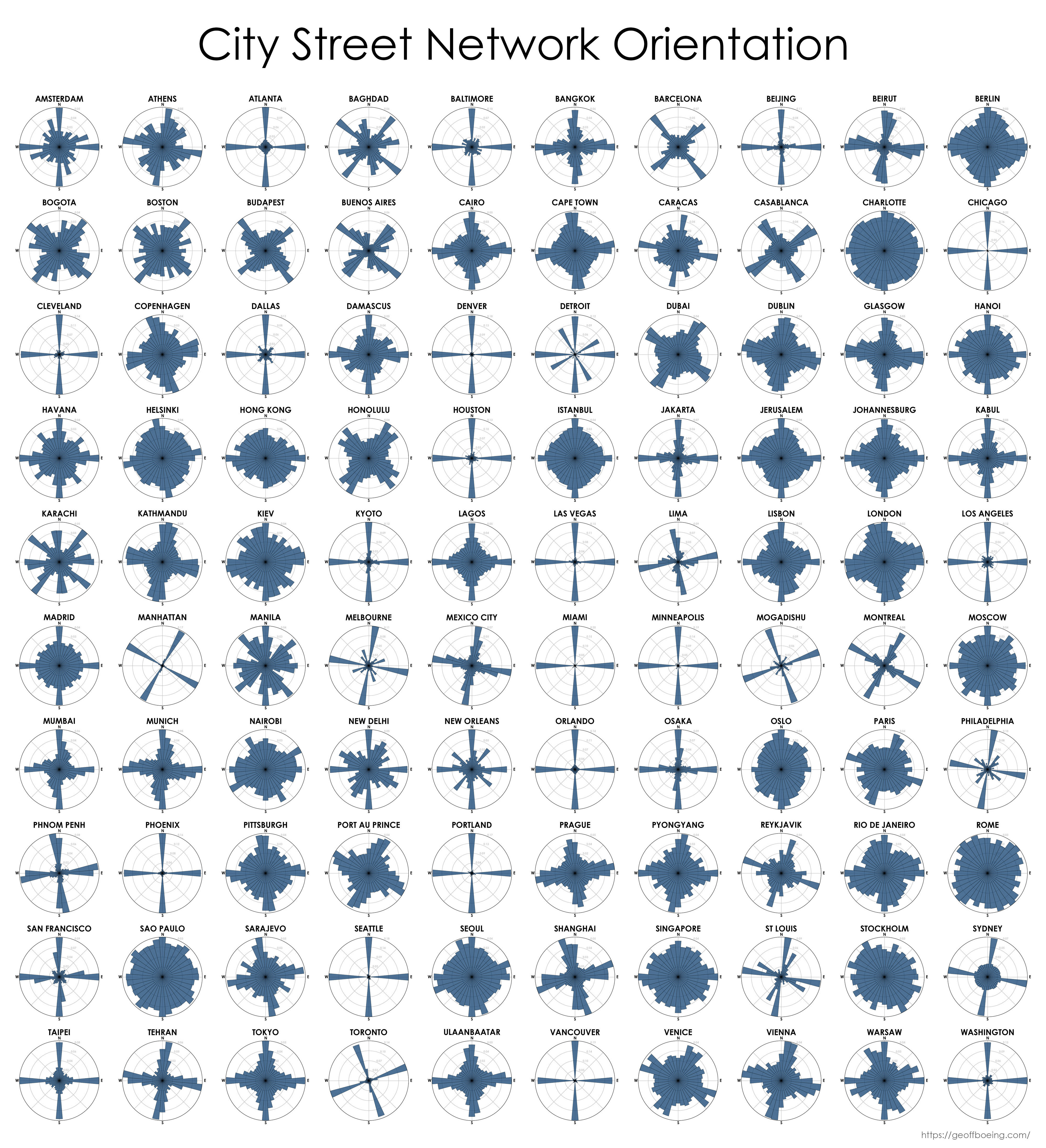
Here’s one that includes more cities around the world
Probably correlates fairly tightly to the age of the city.
More like how organically (or slowly, if you will) it grew and how walkable it is. I suspect the ones that looks like crosses are made mostly for car traffic.
I’m pretty sure that the blobby ones are more than 1500 years old while the ones that look like crosses are just a few hundred years old.
I find the helix-like symmetry in Berlin quite pleasing
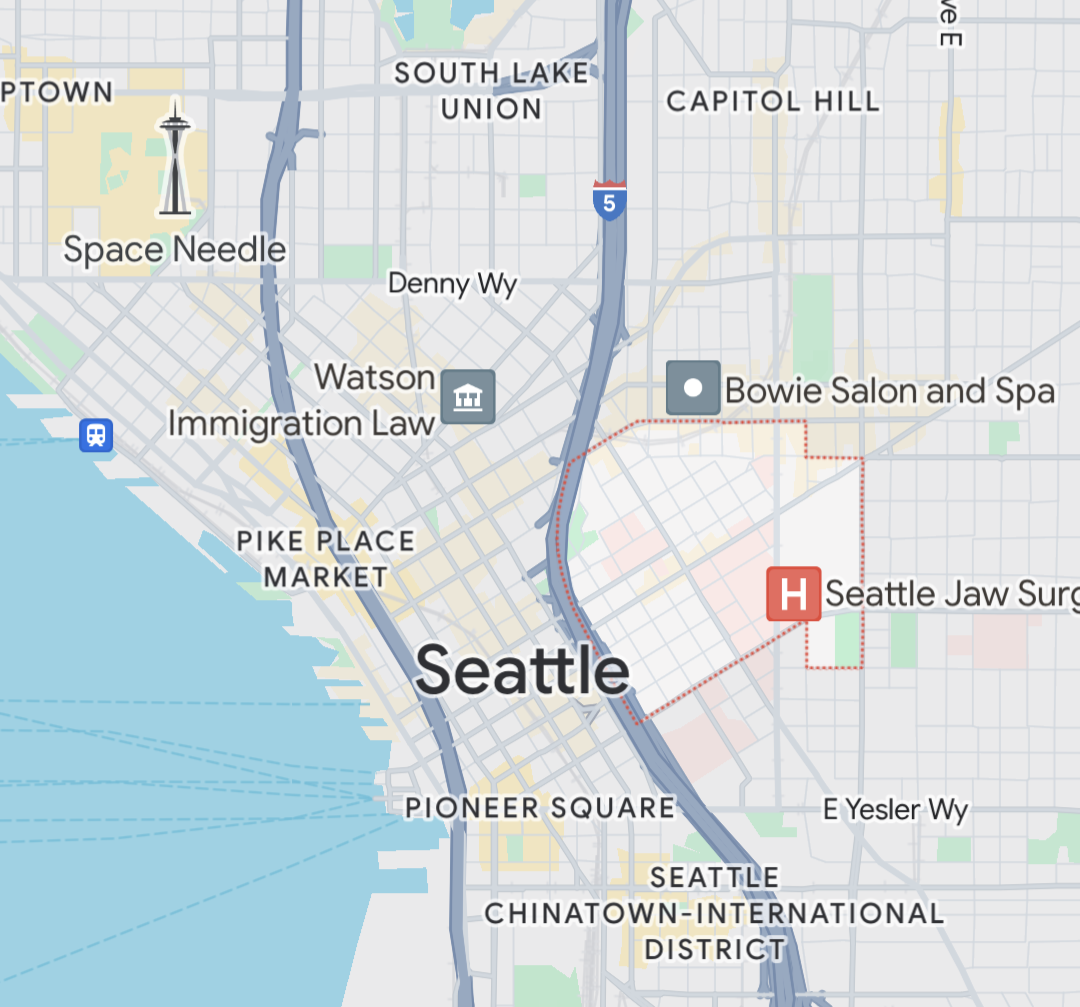
I wish this map weighted streets for density. Seattle is mostly NSEW as portrayed in the plot, but the downtown core famously has two competing grid systems.
Ah, that explains Boston.
That’s what happens when a city never gets a chance to burn to the ground and start over.
There’s still time.
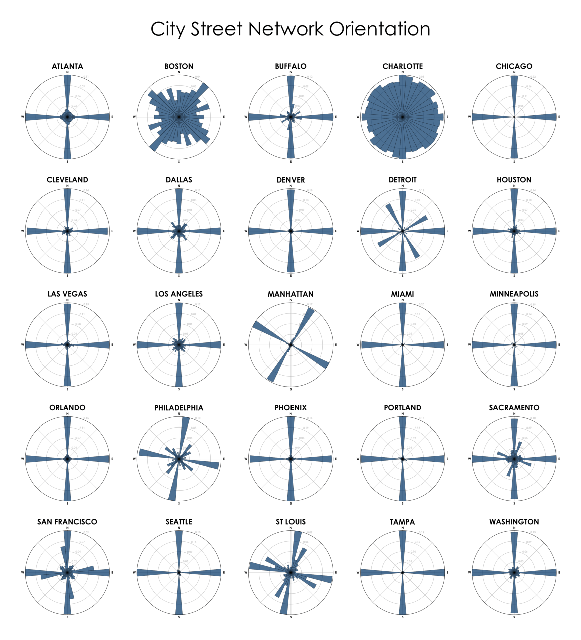
If I ever have to drive in that city again I’ll help start the process.
*looks at orlando*
Yeah this data is bullshit lol. Or it’s looking exclusively at the city center and not the city as a whole
Even that doesn’t hold up. See Seattle’s city center.
Showing Atlanta the same as Denver means the level of abstraction is so high as to make this meaningless.
East coast cities are more chaotic than this implies, because of time and growth patterns.
Denver was first aligned along the river, then a NS grid later, which this graphic doesn’t show at all. So while it’s primarily a grid, it’s 2 grids, one that’s rotated about 45°.
I’ve driven in a number of these cities, and this graphic really doesn’t reflect the on-the-ground experience.
Boston is just the worst to drive in.
Boston and Charlotte need to be defragged.
Does Denver’s downtown just not show up at all? It’s at 45 degrees to the rest of the city.
Charlotte might be earth’s most confusing city.
Most places in Europe would have a graph similar to Charlotte. Only new cities in the colonies were build to a rectangular grid.
Almost as if only the US cities were so planned in advance that everything is in a grid.
Boston looks as expected. Not familiar with Charlotte. Is the whole city just pavement?

