2006 🔥
Frutiger Aero my beloved. The apotheosis of skeuomorphic design, killed by a neverending downward spiral towards the least distinctive, creative, and inspired designs imaginable.
It’s really ironic that this design cycle coincided with the rise of high-DPI displays. All those pixels used to upscale monochrome boxes with square corners. What a tragedy.
I miss Aero
I miss it too. All this minimalist design and no soul.
that is disrespectful towards trash
The internet is mostly trash. That it (or software in general) works at all is nothing short of a miracle
deleted by creator
2006 was the peak.
Aero had STYLE. I should look some aero theme for linux.
I prefer 2000, myself
Gotta put that Windows in the bin.
I mean yeah, that’s funny, but I just like high quality pixel art and 2000 was the last generation before they ditched that (or I guess, the pixels got too small to see)
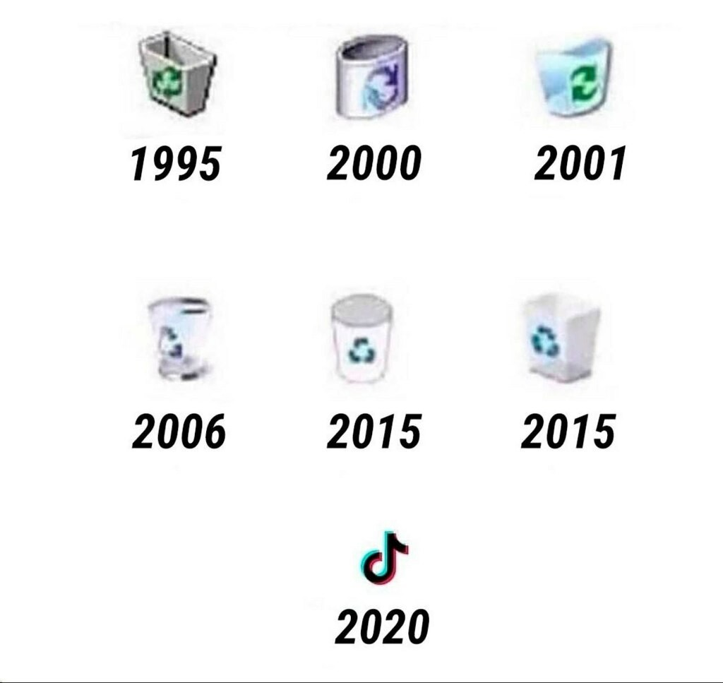
Who tf designed 2000?!
You forgot Facebook Digg and now reddit
why is there some AI upscale fuckery going on here
Why is it orientated differently in 2000 and 2001 and afterwards normal again? What were they hiding and why? What is their secret?
I wonder how much it will take people to realize that having 3 to 4 musk related posts on the frontpage daily is not how you get rid of him.
You’re right, it’s not, but ignoring him doesn’t get rid of him either. That’s not how capitalism works.
Take my upvote.
The reddit dump truck?
