
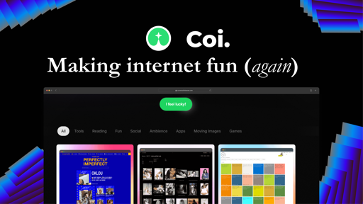
Remember when the internet felt like a giant treasure hunt instead of just… cycling through the same five apps? Yeah, me too. That’s why I started COI (Corners of Internet)—a place where I dig up weird, fun, and happy corners of the web so you don’t have to.
No algorithms. No doomscrolling. Just pure internet exploration.
If it’s cool, underrated, or a little unhinged, it goes on COI.
Check it out: www.cornersofinternet.com
Also, if you’ve got a favorite weird site, drop it below! I’m always looking for new rabbit holes to fall into.
Maybe it’s a generational thing (I’m a 50+), I don’t know, but when I see a ‘Buy me (something)’ or a ‘tip me’ first thing first on the home page even before I can get any idea of what I will find on the website I’m not likely to explore further. I thought you might want to know about that, even I may be in the minority.
Just in case:
- Nope, I’m not cheap. I just want to know who and why I’m supposed to be paying a coffee to (or a pizza) before I decide I want to do it, or not to do it.
- I’m always very happy to see people trying to refocus attention toward a less corporate-owned Internet.
- I hope it was clear it’s nothing personal, just my first reaction on visiting your page. I’ll explore it further ;)
I totally get it, yet I contemplated that decision a lot. This is a self funded indie project, could use a lotta funding.
But I agree, I will be removing that soon, maybe tug it into the footer or someplace. Not like it is helping me get coffee anyways :D
Thanks for the feedback.
Thanks for the feedback.
You’re welcome
One of the genuine use of cookies is to see if the person has explored a bit your own website and then nag.
Maybe a solution would be to make the donation info a toast that pops up after a time or after a certain amount of scrolling has happened.
So people like op are not put of from the start but you also make it easy for people who want to donate.
Yeah, maybe.
Earlier 40’s and I have the opposite opinion on this.
I think the button needs to be prominent so people remember where it is if they find the site useful and now want to contribute. Building things and hosting them isn’t free and I have no objection to paying for quality content.
Haha maybe I need to run a poll somewhere to settle this out, appreciate your thought.
It would be interesting to see the results.
Its like asking people to subscribe on Youtube. People say they hate it but it verifiably increases the numbers by a wide margine.
they hate it less if it’s funny and easy and doesn’t trigger paywall-creep trauma?
yeah a CTA of sorts true.
I have removed it and made it go on the end :D
:)
Some feedback: the “hi I’m coi” thing at the top? I thought it was another LLM AI thing introducing itself. I closed the tab immediately, but then double checked when I read the rest of this post.
The social media links at the top, especially Twitter, are a negative for me. Fuck twitter and Facebook.
The big color buttons (that are not actually buttons) interspersed with text is a choice but it feels very bad-modern to me. If you’re going for more retro pre-shit, maybe take inspiration from https://evenbettermotherfucking.website/ or friends.
Actually I do wanna get a designer for the project in the near future when i make some money with this site and turn it very retroish… Rn i’m working with templates and preexisting codes. Yeah I know its not perfect but it will get there slowly I promise.
Regarding the Hi I’m Coi, yes now I get how it may sound LLMish. But the idea was to kinda introduce a character called Coi who is surfing the internet and fining cool shit uk.
Socials : i know it is kinda negative even I wanna be far away but need to get some traffic for the site. I don’t know how to work around it. Maybe when there is more awareness about the site I will remove it.
Hold on to your design, don’t let some critics change it.
I design web gui stuff a lot, and I am hyper sensitive to most designers including me, being constricted to some conventions. So I really appreciate well designed non conventional stuff, like used to be more common years ago.
Your web stuff adds value which will go away if you conform too much
Edit typos
Honestly all the feedbacks are just overwhelming trying to tag them as good to haves or not.
Thank you your comment clears up a lotta self doubt. Means a lot.
The internet used to feel like a treasure hunt because it wasn’t indexed well, and a large part of the surface content were pages made by oddball people letting their weirdness run wild without social limitations.
Sure, algorithms keep most normies in a social media ecosystem, but it’s also not exactly easy for me to make a truly anonymous website about the awesome predictions I’ve made from looking at the patterns in my breakfast cereal every morning - AND just let it be. There’s pressure to promote it, crosspost it, etc. Even the fun of thought experiments posted to a GeoCities page come with risks now.
Maybe I’m jaded and lack the youthful energy to stay up until 4:30am slapping im14amdthisisdeep stuff somewhere. Maybe everyone else that’s just slightly weird still expects to get paid for that with ads when it all used to be free and fun.
Love the idea! Kinda like fark.com before they got all shitty.
I’ve never been on fark what is the story though
Same old story of a community-driven site resorting to ads for revenue. After feedback they started a subscription-based version called totalFark that didn’t have ads. Then they introduced ads on totalFark as well, but didn’t vet their advertisers. So some of the banner ads were running malicious code on users browsers.
Damn that’s crazy… Why allow ads on a subscription site what makes it okay to do that.
This is pretty good and cool. Already found some hidden gems I didn’t know about. Possible suggestion for another category is for youtube channels. Youtube’s algorithm sucks now and there are only about 4 youtube channels I regularly watch. So it’ll be cool to have a category to suggest good content creators on youtube .
I know this is an XY fallacy type response but you mentioned YouTube sucks now so I’d like to interject.
Use the subscriptions tab. If you only watch 4 channels, sub to those channels.
I have subbed to all of them but video recommantions on youtube aren’t even related to the video or even topic nowadays I find. I get mrbeast wannabees in the related tab despite never watching them. I can’t find new channels because algorithm even with no influence recommends stuff I’m not interested in unlike when youtube was first around and it recommended you content creators based on your personal watches and not the algorithm
deleted by creator
I did think about that, but the problem with that is I might have to then feature instagram creators (Thank god TikTok is banned jk :P)
I do wanna feature some youtueb videos, idk what should I do.
I would love suggestions.
Maybe content creators in general? I’m just spitballing but ultimately it’s up to you.
For suggestions on content creators.
Grant Wisler. Very underrated comedy skit maker. Reminds me of the early days of smosh and those kind of youtube videos but blends the skits with modern storytelling so it can go from a skit into a existenital piece of art and it doesn’t feel jarring at all. I feel like he’s going to make it big if more people knew about him.
Misohungrie. Cooking channel but cooks from those cookbooks based on fictional IP (One Piece, Ninja turtles, Gremlins even) to see if the food in the cookbooks is actually any good or if it’s just a cashgrab. It’s a very specific niche but a niche no one else is doing to my knowledge and he does it well.
Another cooking channel, sortedfood. Just a group of british mates having fun cooking food and learning about food. Sometimes they gameify things by having challenges but you always learn something new when watching it.
Ah I do wanna bring a category that says Creators or something like that. Okay then I think it is possible for me to then tag them to a platform like youutbe Or instagram. Could be nice yeah. Also thanks for the suggestions watching Grant Wisler as I type. :D
This seems neat.
It’s not just the Internet, though. There are no more gatekeepers or water coolers and everything is fed on demand. Have you noticed that TV and movie events have slowed down to a trickle? Ever found a cool show on a streaming service and found that nobody is talking about it unless you go search for some community of five people who are super into it? Nobody is playing any games and talking about them unless they’re finding them through some influencer or they’re just the same four big games that have dominated the market for the better part of a decade.
That’s not going to revert back with something like this, I’m afraid. We’ve just lost the structures that got people to share in those collective moments and I’m not sure there’s a way of bringing them back. On this side of the apocalypse, anyway, so maybe that’ll fix itself.
True that is why i added a section for movies (moving images) I wanna fill that up with underrated indie movie and also a section for games with unique approach to it. All that is possible to do to develop the indie creators.
It’s broken without JS. Not so old-school after all.
To be clear, the idea is not to be Old-School it is just to kinda bring that joy of discovery.
I was curious to click on one of the sites (bread-on.earth), but the link appears to be dead. Is there a mechanism for reporting dead sites?
bread on earth : they are updating their site… It is a good site, where you could find everything about bread. They also had recipes of antient bread. I think they’ll be back soon.
Maybe I will move it to draft on out site… Well the only way to report rn maybe an email. This is a one off occurrence, maybe I will think of something if more sites are going offline often.
What is this corporate joke of a ui?
🥲 best I could do
I like it, I find it refreshing
Thank you so much…
What a horrible landing page.
also why would you say it is horrible, I’m collecting feedback. Would help me see what you are seeing, Thank you
The initial landing page looks extremely messy and chaotic. It looks like it’s made by an edgy tech intern who’s goal it was to make it as modernly bad as possible. There’s as many fonts as there are words and equally as many random images and CSS tricks that make it extremely hard to understand what the website is trying to do.
I’m sorry for the hard comment, but that’s what I see.
I suggest 2 main things:
- Keep it simple. It’s a skill to keep something both interesting and simple and it’s very important when designing landing pages.
- Split your personal stuff and the service you’re providing. You’re mixing 2 different types of website and it does not feel professional.
I could give a much more in depth review if you want.
Wouldn’t mind in depth review!
- The top banner looks quite out of place. Your whole website uses huge full width vertical separation but the top banner is a tiny thing at the top, that looks like it should be sticky. It also uses round borders while your footer uses square borders.
- The “At your service” could be misunderstood in the current landscape of AI assistents. It might imply some sort of smart interaction.
- I would suggest you emphasis only 1 or 2 words in your landing title. You need to have 1 single thing stand out when they see that for the very first moment. “Coi” does not mean much. “Tiny Corner” “Internet” could work alright together.
- This feels awefully out of place: https://framerusercontent.com/images/NEDqhYBfbsBdcBYtqq012PD2C8.gif Maybe it could in the same emphasis as “Coi”, or be placed somewhere else entirely. I was trying to figure out if it meant some sort of word in the sentence.
- The Buy Me Pizza has been moved to a much better location.
- The second thing I notice when I visit the page is the “Psssst”. It’s like you already ended the stream of information and switch to something else. You give me an option for a waiting list but I have no idea what I’m waiting for.
- I would remove the border at the bottom of the top landing part. Either have a smooth background or have it cut into vertical parts like your footer.
- The “I feel Lucky” is a bit flashy and placed right under the border and above the menu. I think it would be much better if you have it stand out much bigger and with more space around it. It feels like a second class citizen, while it might actually be a fun feature of the website. Small example of what I mean: https://i.imgur.com/ykZyrID.png .
- The stars effect on the hover of “I feel lucky” is nice, but it shows way too fast compared to the rest of your animation heavy page.
- The menu for the types of websites could be made bigger. The thing I don’t like about it is that it has a different background that matches the original too much. https://i.imgur.com/FeUxtUT.png
- Hovering over the cards is the same as the stars. The change is too fast and too harsh
- The badges underneath the cards (NEW, POPULAR) would be better with different colored backgrounds to easily spot what’s new and what’s popular. A trick is to zoom out and have it still make sense. I would also use green or blue for “New” instead of orange.
- “Load more” could use a spinner on the button to show that it’s loading something. Always consider your site to be slow on your end-users machines.
- The footer separation is very nice but might be too huge.
- There are 5 mentions to contact you in your footer: “Let’s connect”, “let’s talk”, “contact me”, “hit me up”, “submit suggestions”. As I said, keep it simple and draw focus to just one of them. Drop the others. (especially the submit suggestions logo)
- “I unearth internet gems that make you go 🤯”. You make it very personal but I fail to understand, even when reviewing this in depth, whether this means you, or your website (which has a persona). Try to make this much clearer.
- Your Blog “Dear Diary” is weird and is like a totally different website. I fail to see what it has to do with your service “find a website from a corner on the internet”. Really try to separate these because it will confuse a lot of people.
I could do more. It’s up to you. I know a lot about UX and have been a web developer for almost 20 years now.
Thank you so much for the pointers, I am reviewing everything.
No problem. Some of it may be harsh but I’m always trying to help.
Good luck on your project!!
Thank you, I made some changes already. Need to figure out the banner. Wil keep you posted, thansk again.
There are 5 mentions to contact you in your footer: “Let’s connect”, “let’s talk”, “contact me”, “hit me up”, “submit suggestions”. — Corrected it “Load more” could use a spinner on the button to show that it’s loading something. Always consider your site to be slow on your end-users machines. — Added
Your Blog “Dear Diary” is weird and is like a totally different website. I fail to see what it has to do with your service “find a website from a corner on the internet”. Really try to separate these because it will confuse a lot of people. ----- Hmm I dont know I wanna use it to store news letters and write blogs
- “Load more” spinner - Added
- I would suggest you emphasis only 1 or 2 words in your landing title. - Done
- The “At your service” could be misunderstood - Removed
- This feels awefully out of place: https://framerusercontent.com/images/NEDqhYBfbsBdcBYtqq012PD2C8.gif - Removed
- “Psssst”. It’s like you already ended the stream - Working on it : I got no idea yet what to do
- I would remove the border at the bottom of the top landing part. - Removed
- i feel lucky - made more space around it
- Buy Me Pizza - moved to footer
others wip
Wow you’re really going for it. Awesome.
Looks a lot better already.
Yes Sirr. Thanks to you.
The best I could do atm sorry :(

