

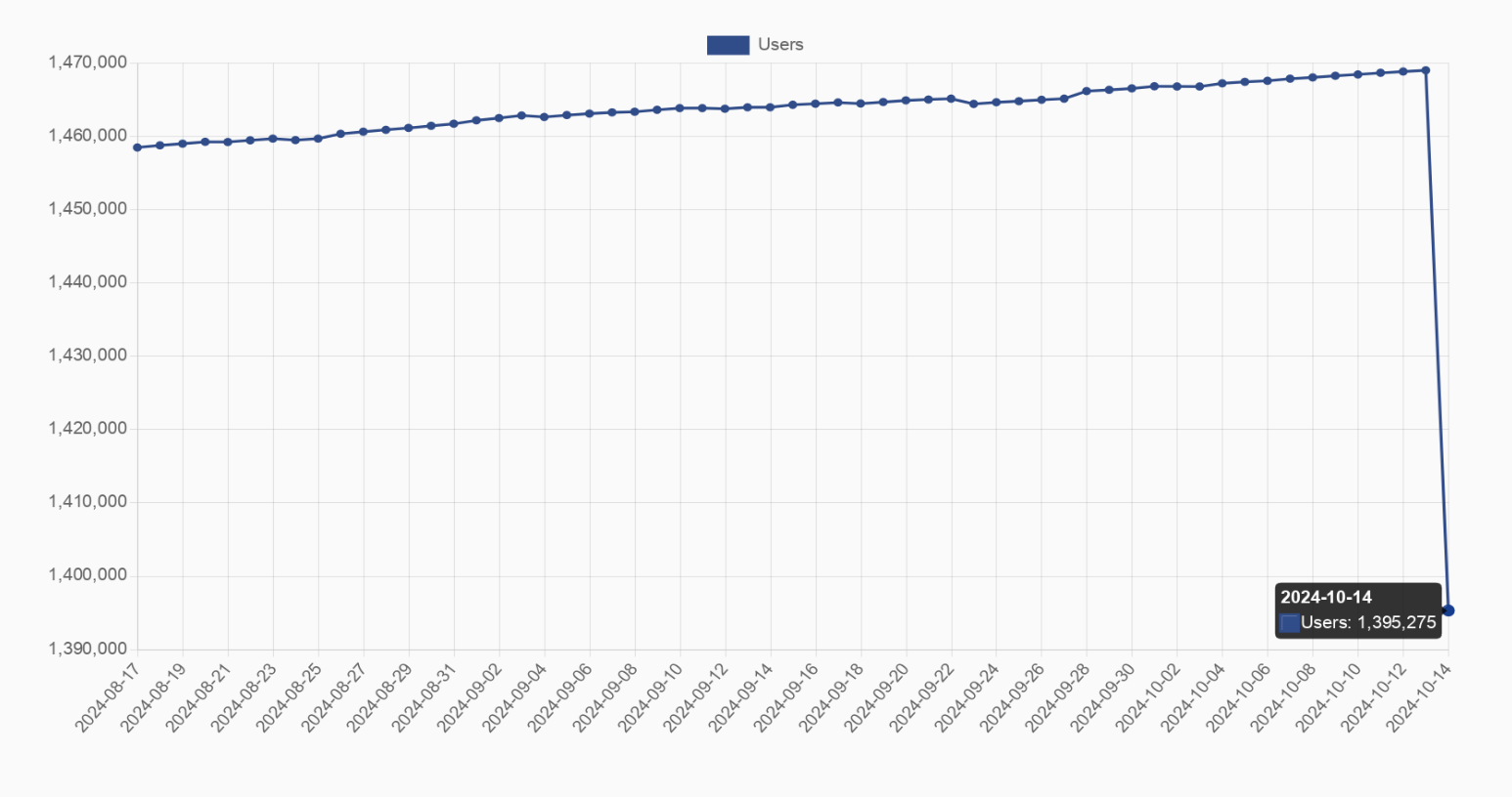
That graph is so misleading. Makes it look like almost all the users disappeared but the Y axis only covers a small range at the top.
The full range is about 5.5%. So while it is misleading, a 5% drop in a graph that consistent isn’t nothing. Something substantial absolutly changed
Maybe whole Instance that went offline.
That’s my guess to
Cool then it should be 5.5% of the visual space for it to not be misleading. But it’s represented much larger. And OP is (edit to sound less mean) not updating the post sooo…
I call shade
I captured the graph with the number after the decrease at the bottom right to try to show the number of lost users, but I see where you come from
If you saw why people would criticise it then you’d… edit the post, recapture the graph with an accurate visual representation including the zero on the Y axis?
Well…
- that’s how the website displayed the graph when I took that screenshot, I’m pretty sure you can’t modify the axis
- I’m not on my computer at the moment, editing is the most I can do right now
- if you can capture the graph with 0 on the Y axis, please post it below and I’ll update the picture
Or just inform the other adults to consult the axis for clarification.
Lies, damned lies and statistics.
Which one of you forgot to open the app so we all ceased to exist to save on simulation resources?
Go on… lol
Did an instance go down?
Probably but which instance has over 70,000 users?
not sure when entire fedi-reddit is like 50k AMU lol
LOL
Was the metric measured before the day the was over which would limit the timeframe of the final day and show fewer users?
I dont see this chart when I click the linkIt should be there, it’s the second graph


