
Nero burning program used an icon of the colosseum on fire to represent their burn button.
I see no issue with using a floppy disk.
I like it. It’s universally recognisable, you know what it means and what it does.
It’s only universally recognized because of precedent. The true challenge is to create something that can be understood by someone that has no background with computers (or whatever)
Like the radiation ☢️ thing, danger ⚠️ , are supposed to be examples of this. Radiation more so because it’s not supposed to rely on language even
Now excuse me while I press the call button on my phone which is shaped like a landline handset from 30 years ago
For sure, but it doesn’t actually matter whether it’s abstract from the outset or has become abstract through technological advance so long as it’s unique and understood. Someone who’s never seen a floppy disk will still learn it quickly, because it’s distinctive.
But what if we go extinct and computers remain functional? will aliens that discover our planet be able to save their documents? Did you think about that??
I’ve said it
oncezero times and I’ll say it again. Far-future hypothetical space aliens should RTFM.
.not_porn
Looks like a Switch cartridge as well, so no, that’s gonna be lost soon.
By that argument, it looks like an SD card.
I’d argue that the
insanely satisfying stim toyshutter of the floppy keeps it unique, though.
How is the nuclear sign in any way universally understandable? It is properly by learning it’s meaning.
It’s intended to visually represent an atom with radiation emitting away from it.
It’s not “univeral” in the sense that anyone could understand it, but in the sense that anyone who knows about what radiation is would have a clue - be them people now, or some far-future civilisation stumbling across a nuclear dump site, or aliens. It’s a depiction of what is going on.
The symbol also uses elements of graphic design that make it feel unwelcoming and hostile even if you have no understanding at all. It’s a design that clearly telegraphs “this is not a good thing”
Similar for the biohazard sign, which in its strange curves and spines looks almost “mutated”
I respect all the science and research in hostile design, but then I rember the chilli peppers, just trying to keep safe from mamals by simulating the feeling of fire in their mouths…
Evolution doesn’t really work that way though. Peppers didn’t evolve spiciness to keep animals away, they essentially randomly developed a mutation that made them unpalatable to most animals, and that increased their odds of survival. It’s not doing X for Y reason, it’s X happening with Y as a consequence.
The design process is actually very interesting to read about and the intentionality (whether you think it’s effective or not) is essentially the scenario that if someone were to stumble across it in 10,000 years they would recognize it is dangerous and leave it alone
That said you are probably right given there already have been a few notable incidents where people have broken into discarded medical equipment and stolen radioactive sources, poisoning dozens of people in the process
It’s interesting how that precedent happened though.
30 years ago saving something basically involved taking a floppy, putting it into the floppy drive, and then hitting a “save” button. That was often because computers didn’t even have a hard drive. And, when they did have a hard drive, having your files on a floppy drive was basically the only way to get them onto another computer. So, because of that, a floppy drive was pretty universally recognized as a place where you saved files.
In the time since then, saving to a hard drive became more common. But, it’s hard to use a hard drive as an image for “save” because only computer geeks know what a hard drive actually looks like. Even if you could get people to recognize a hard drive icon it’s also ambiguous because you use your hard drive for many other things other than saving. Finally, it’s also less necessary to put the save files on external media, because you can email them, upload them, save to the cloud, etc.
The only physical media where people still save things is USB thumb drives. So, you could put in an image of a USB thumb drive, which more people would recognize, but that’s more ambiguous because people only save files to a thumb drive in certain specific cases. It’s also harder because there’s not really a globally recognized thumb drive image. All floppy drives had to look more or less identical because of the constraints of the disk drive system. But, USB drives only have to have the USB part in common – and in some cases that’s hideable or retractable.
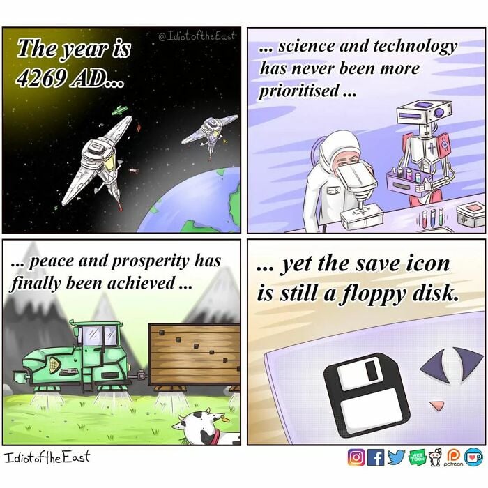
The idea that human society will make it to 4269 as well as the old Twitter logo at the bottom really dates this one. 😥
There’s KDE software (might be a Linux-wide thing, idk) that changed it to a down arrow pointing to a rectangle. I don’t like it. I really don’t fucking like it.
That’s not true, this is the current version on Arch and it’s a floppy.
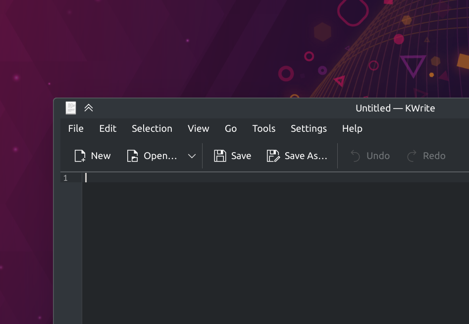
Huh, interesting. It’s probably my icon theme, then. I’ll check when I get a chance.
My favourite are the kids excited that their mom 3D printed the save icon when she showed them a floppy disk.
Which never happens yet everyone repeats it as if it’s a common occurrence.
I like the joke, but let’s not pretend this is something that happens.
The Floppy Disk is Computer Jesus. They both died to become the universal symbol of salvation. ;)
The various symbols found on audio and visual media comes from tape reel machines. Specifically the right arrow Play button only makes sense in relation to tape movement, yet we use it for just about any format to begin play.
Timelines also progress from left to right, so that one holds up
In cultures with a left-to-right writing system
Oh really? I never thought of that. Interesting!
I’ve seen a growing number of programs that use an arrow pointing towards a picture of a computer or hard drive for "save* and an arrow pointing away from it for “load” and I feel like that’s very graceful skeuomorph to shift to that might hold up for longer (although it breaks if it’s talking about cloud save, but replace the picture of a computer with picture of a cloud and you’re back in business I suppose)
I’ve seen those being used as download and upload but not for saving.
I want to say the game Soviet Republic Workers and Resources uses the exact iconography I described including for cloud savings vs locally but I could be misremembering
Downloading is a type of saving
I’d be surprised if using these kinds of point-and-click GUIs was still common in 2244 years, as opposed to some kind of language- or thought processing. Then again, people are still writing with pen and paper sometimes, despite all the digital advances.
Pen and paper is still the superior way to make your first draft and anyone who disagrees is wrong.
I hate hand writing and drawing.
My drafts are computer aided.But in case of emergency, I have muscle memory.
Do you imagine how wonderful Lemme could be if everyone drafted theirs posts on paper, prior to clicking “Send”?
Well, pen & paper was modern 2 kya.
Maybe, just maybe, someday it gets updated to an SD Card.
The idea of hover cars have always been so silly to me. Yes let’s waste energy on counteracting gravity instead of just using a wheel lmao
They’re good for rough terrain, so ironically a tractor is one of the less silly things to make hover
Also tyres destroy the crop they drive over
You got me there it does make sense for a tractor
This is the future I want
Also the phone app icon still resembles one of those old banana units, even though phones haven’t looked that way in 25+ years.
so shall it be
Path dependency


